Sorry very late to the game.
My wish would be two fold realistic and totally wishful.
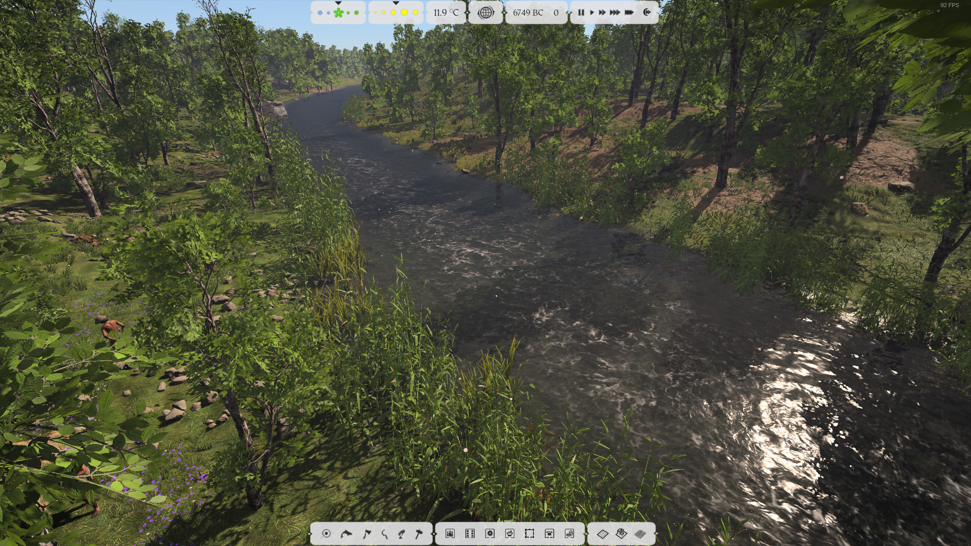
First all non modal UI be able to be positioned and scaled and then the big one when I say positioned I mean on any display. In other words allow your beautiful art be displayed unobstructed on the main display and put the UI display on screen 2
Now for the wishful one using network/WiFi TX the UI to a external app.
Desired goal.
Main computer connected to 70" LCD HDM 4k 30fps TV located on wall 8-10 feet away. With a wireless mouse, keyboard and Status display located normally and the UI cast wireless to a large tablet like a iPad.
Just think of the demo presentation of this you give the demo on the wall mounted TV and tablet UI to wow every one much like you did for kickstart and indigo. Then you demonstrate traditional single screen play with the normal response of that’s an impressive game followed up with the jaw dropping comment both of these modes are included in the game not just a fancy demonstration.
By the way just think this wish is not all that hard and I will bet you have backers that would write the tablet app and modders who would customize its look for you after all the only thing needed is sending a block of data out a network port and providing the map of the data and receiving a much smaller block of data from the port. The app handles all the dialog and true UI unloading the base processor and GDU
Regardless at least think about providing some way allow coprocessing of the UI for us Micro managers.
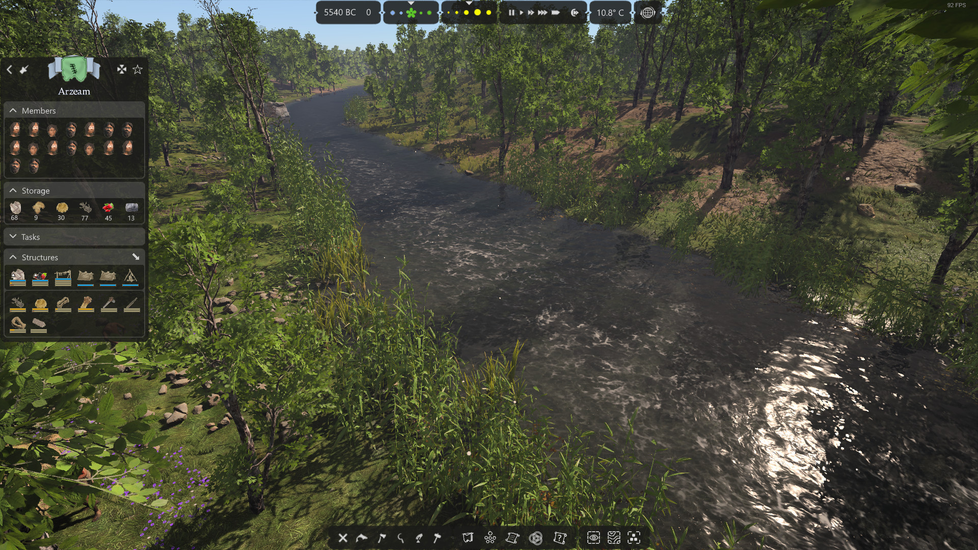
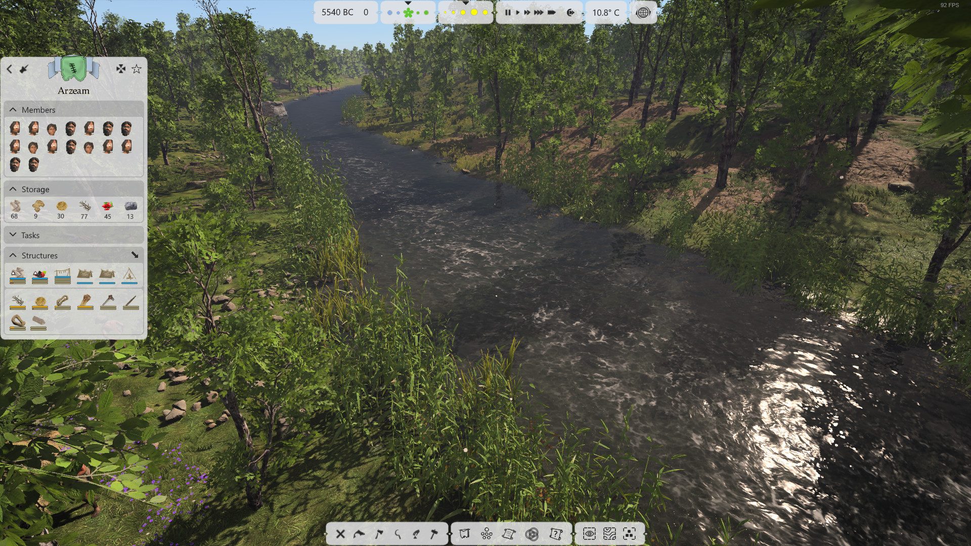
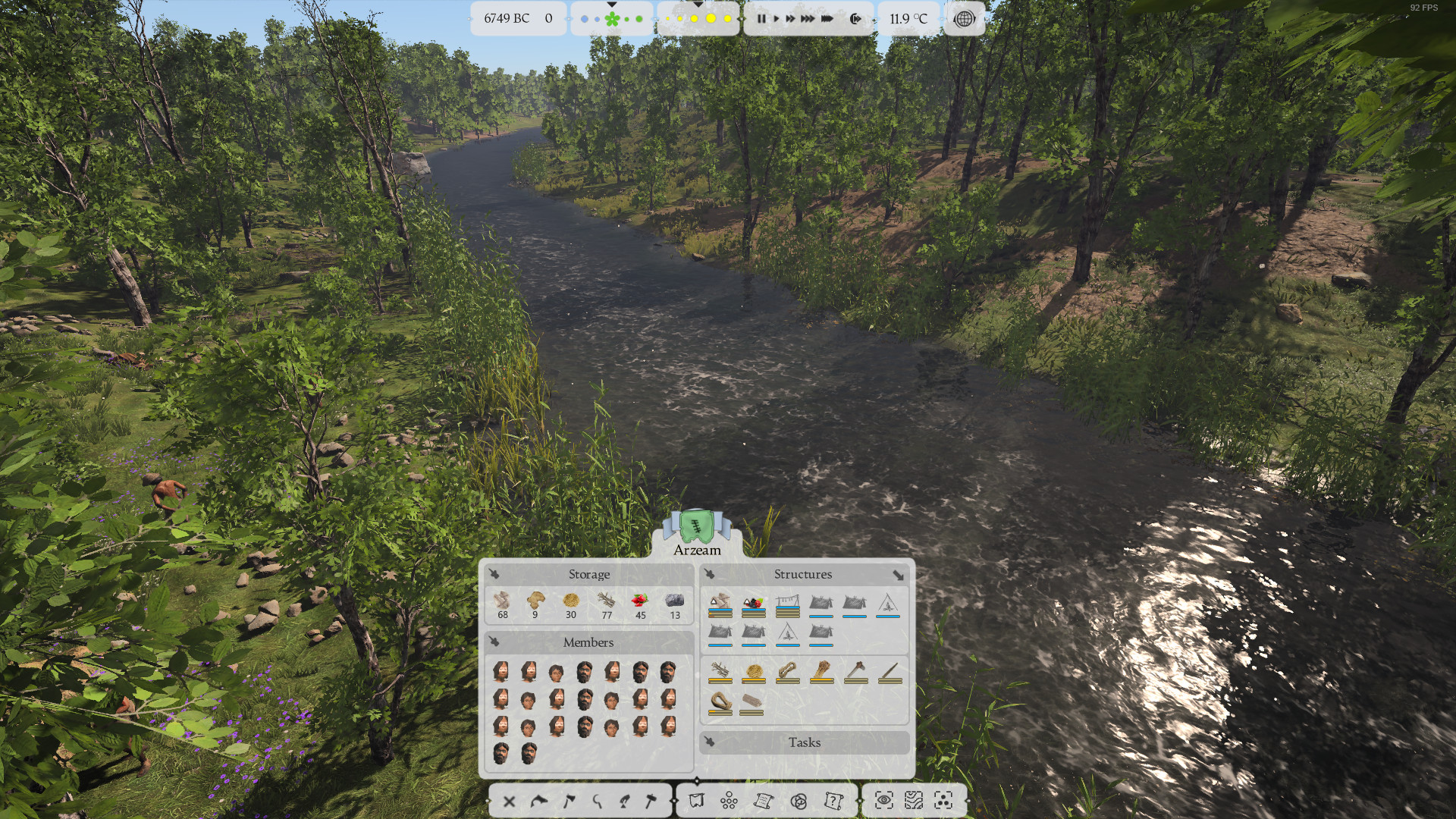
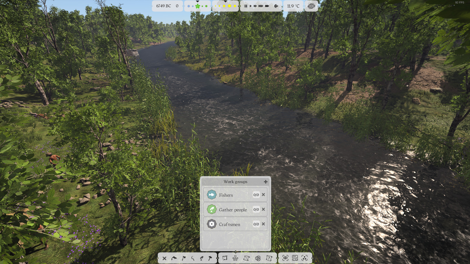
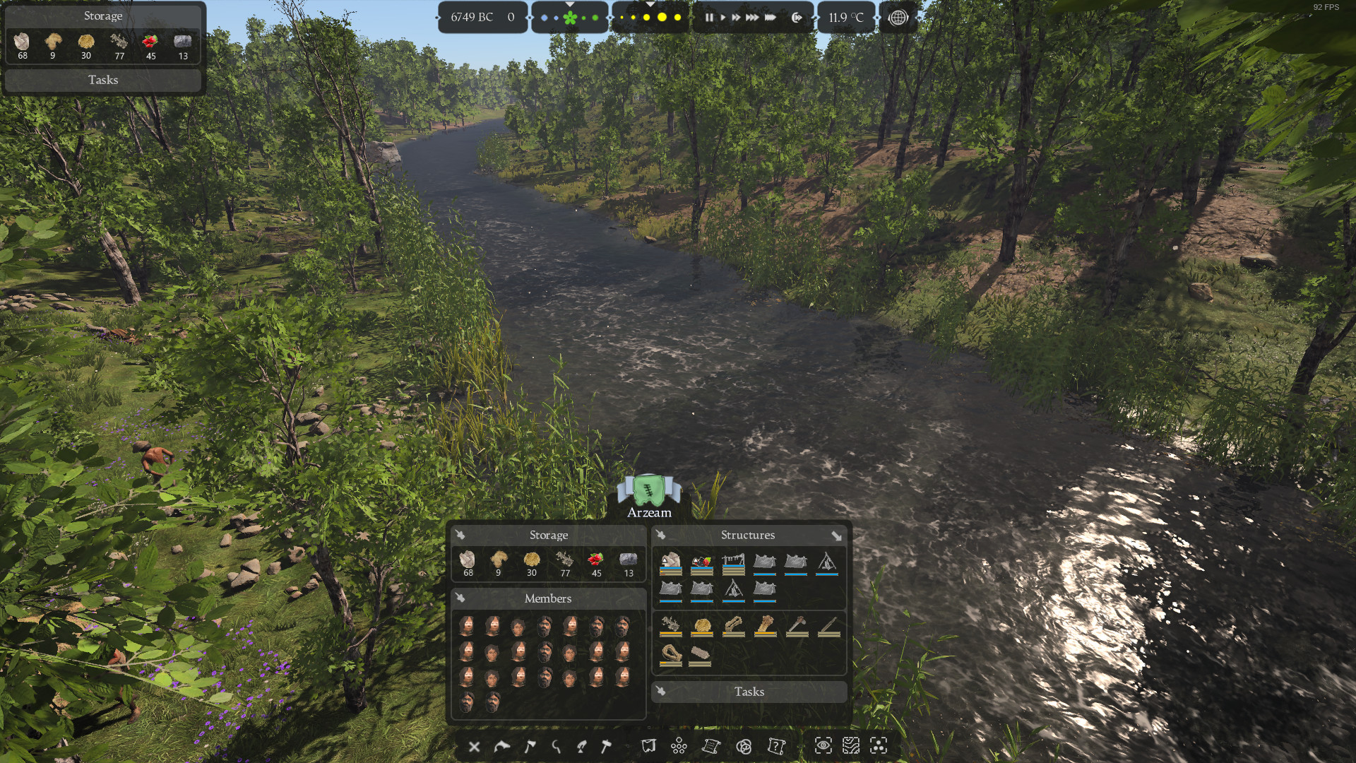
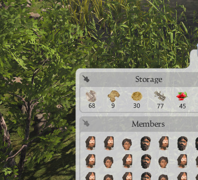
Interesting. We feel that information buttons should be nearer from information panels. Also we are discussing about how to show groups related with the selected entity at first level.
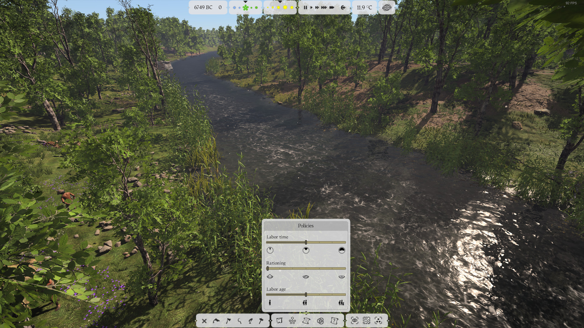
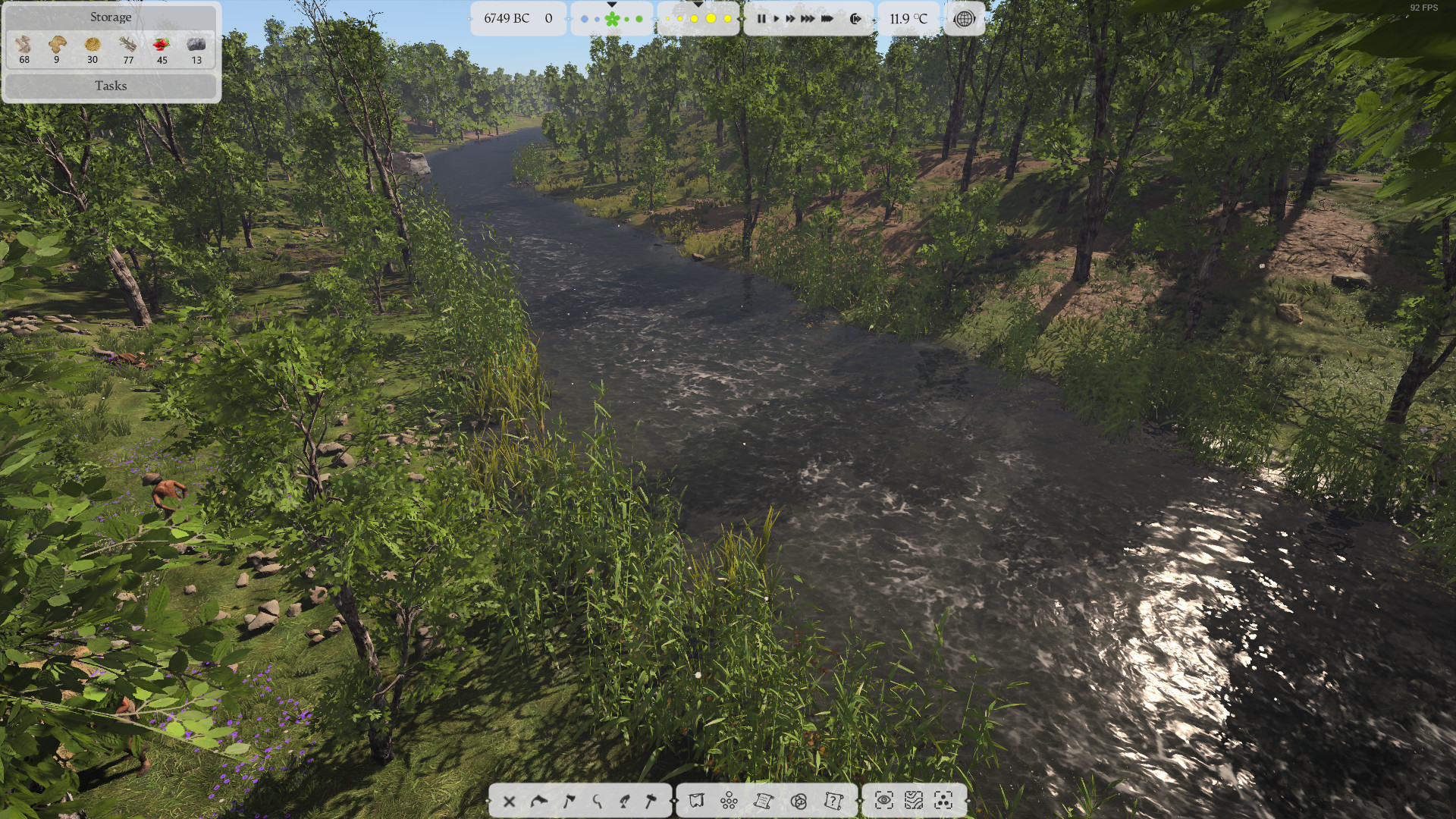
I’d swap temperature and the speed controls. Makes sense to have temperature with time of day / seasons as they’re related information. Speed is more a gameplay setting.
Or can the temperature value be included in the season or time of day box, not sure it needs to be separate.
Our current idea is to put groups related to the selected entity in the top right corner. Not sure what do the “pin button”, could you elaborate?. Also in my opinion info panels and info buttons should go in the left side. Action and build buttons are ok for me in the bottom of the screen. Anyway these are only my opinions and we have to discuss everything and take a decision.
That sounds good. Displaying related groups like that would probably help it not be hindered by future changes in the menu design.
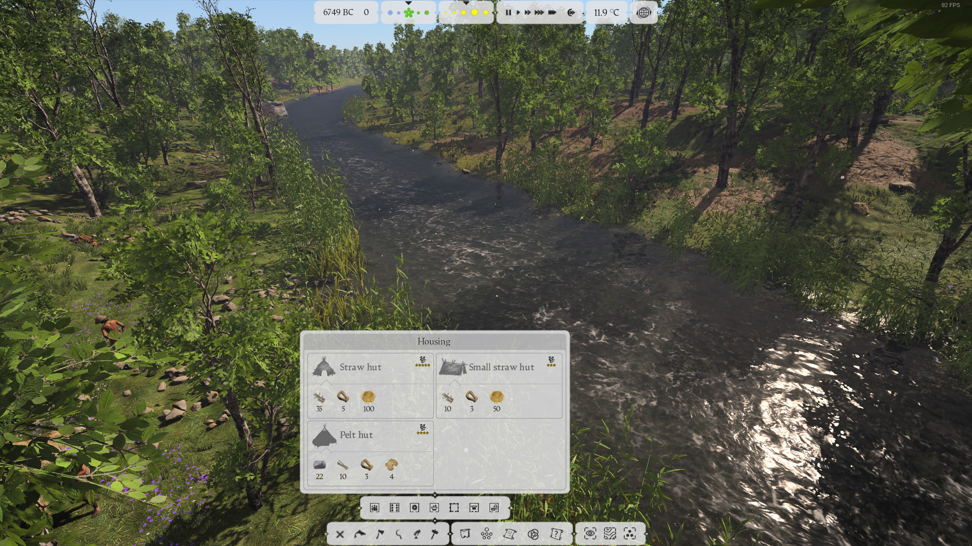
Clicking the pin button for an information box would make it display in the top left corner of the screen like so:
I would argue that they are more like tribe management tools rather than information tools. Players are going to be using those menus considerably, so they should probably stay with the other buttons that will be used regularly.
I’m glad I could help give ideas for the UI. I really enjoyed putting all of that together. In my opinion, the menu panel on the top left needs to go to the wayside. It’s the main premise of the current UI, which has largely gotten tons of negative feedback. Functionally, the UI is great. I think the main problem people have is the scale and placement. I don’t think I’ve come across many people at all who prefer the information panels/menu up there. At most, I would say that we need to be able to choose what we pin up into that corner.
This is great work Quittix3. I really hope some of your ideas get implemented.
I love the pinned sections idea !
the extra toolbar with policy and culture etc is also a good idea.
my feedback would be the center tribe menu looks a bit out of place being so narrow. what does it look like
with the pinned sections in top right and the main menu on the left as it is game?
Good job, Quittix. Only one remark from my side. the transparency don’t work, as long as it is not blurred in the background, like in my very old suggestion. Otherwise, it’s too unstable in motion. but i think it is not possible due graphic resources.