
I agree that the examples were firmly attached to a certain culture or age, and I also wrote in the beginning that it would not be feasible to do similarly in such a wide-spanning game like this. The pictures were merely an example of how a more elaborate version could look. Scale it down, and I believe it could work quite well. For example the stone element at the bottom of the screenshot from Chariots of War. Stone slabs like that, especially a bit more grey, could go well with 13th century England as well as Stonehenge, as it were. And that’s just decoration of an empty space, of which there would be little in Ancient Cities. But surely the menus to the left and right of the screen, in the first comment in this thread, could be less pappery, less sharp edges, less modern, than they are now? A leather surface roll to make symbols upon would have been ubiquitous in ancient societies, just like a stone “slab”. At least a less perfect rectangle?
There is still some time, let’s see what the newer games are showing in this direction. How had that “anno” and “the settlers” solved that at the time …?
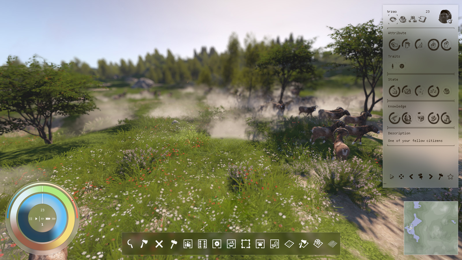
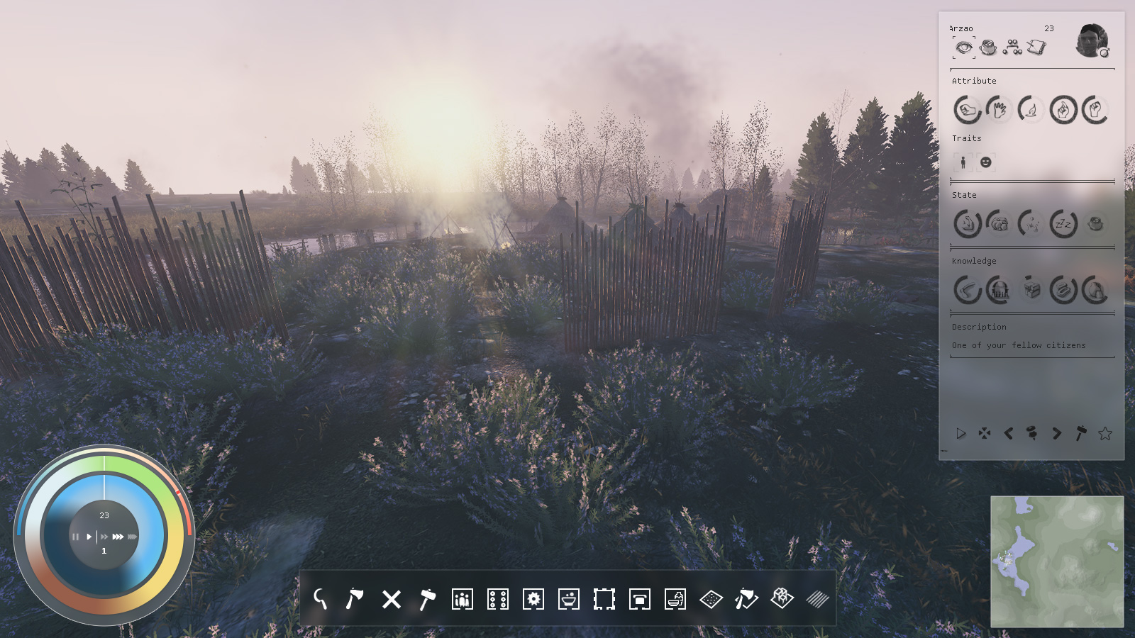
Is the population panel on the top left just for favorite/flagged pops? Or is it a total population screen? I feel like it would get super invasive if it shows all of your population, especially as your city grows from a small tribe to a city. Given that screen will be super helpful when your tribe is small and every last person you have is crucial, but once the extreme micromanagement of each character is no longer needed, is it kind of a pop down menu that you can close? That would be nice.
That UI will evolve to be a character search tool.
For now it is very WIP and it list the 30 best characters of the selected attribute.
Have recently played a round of Cossaks again, find the arrangement there very clearly. What should also be considered: There will be things that are necessary for the city and the inhabitants (wood / food / stone etc) at the same time that are also merchandise. Similarly, the goods produced in the village, which can become very diverse over time. I think you should have an overview of that. In “anno” and many other city-builders take over the warehouses, was it something like this already in the Neolithic or were it rather family productions?
So in the case of trade not with the village but direct “factory-sale”?
I would personally like to see the ui “Skinned” for different eras, depending on the players personal preference.
For me I prefer a sleek, modern, non intrusive interface.
As for the functionality, Keep it simple. Keep it clean. And keep it from being a distraction.
Also, revealing parts of the UI as you progress through the game would be a welcomed feature/function as sometimes a fully revealed interface at the start of the game is extremely overwhelming.
These are a few recent examples that have an extremely overwhelming UI that actually had me quit playing within a couple hours in most cases. Too much. Too fast. Too much clutter. Too confusing.
This is already planned.
UI will show new options when new knowledge will opens new features.
A recent negative example is the upcoming Britannia Total War.
The idea of using the Bayeux rug as a template for the interface was obvious at first. Fits in the time and tells the story. The result is a colorful comic that hinders the orientation rather and only by constantly reading the captions explained. I think photo-realism is closer to our information processing today. After all, players need to understand and play the game, not their ancestors. 
All good points … though people’s tastes may vary. Regardless, it’s not (at least not predominantly?) based on the Bayeux tapestry, based on what I see and what I remember hearing about the design from the creators.
… if they had remained true to the original, it would be less colorful, right.
The wall-carpet is not really “nice”. He is impressive, tall and a witness of the times. And because he is so tall, details can be seen well. A helmeted head, scaled down to 1x1 centimeters (always the same) does not contribute to the orientation and differentiation. The name below makes the difference. Sure, tastes are different, but as a guide I would say: subject misses.
It’s beautiful, but colours seems too much gentles, naives. Don’t feel as an harsh, mystic, wild and mostly unknown lands.
In general I see it like 3pmusic
And when I see all the problems with different ages, not relying on one culture etc.
So for me this is leading in only one direction. The full opposite of what is in the game. You figured it out already.
Don’t imitate the game itself. 100 years ago people had no change to learn and have fun with computer games, because they didn’t exist. When people wanted to see and learn about ancient times they had to visit the museum. So why don’t use elements from modern museums?
http://archaeografica.com/storage/_RMC7373-Edit.jpg?__SQUARESPACE_CACHEVERSION=1347429750993
The idea sounds good, but … museums are static, the movement takes place through the viewer. The presentation must motivate, make curious, explain. The exhibits are small in relation to space, time does not matter, interacting is rarely possible. It looks different in the game. The museum is full of exhibits in a confined space, moves around the viewer, he must interact to keep the exhibits in motion and to organize, time is limited. The presentation is more like a cockpit, grasping, understanding, assigning, deciding, acting - as the museum moves on.
Of course, the taste of each player is different, maybe you could release the design of the interface later for modding. As a basic design, I find the current approach good, during the beta we will see if we can be happy with it
I tried and tried… but in the end, I thought, all I do is building a macOS/iOS interface 
no, it is really hard to do it right. to go for the simplest, cleanest, I did this: frosted plexi, so you never lose the whole picture. it is calm and has enough contrast for text and icons. it is in the details… like always
@Martin
That’s surprizingly elegant, and this allows me to better understand what you meant when speaking about museum.
Although, as a video game translator, this raises one very practical concern: I remember an older interface in a game where I had a tooltip that showed red/yellow/green words, and the red words systematically were displayed over a red part in the underlying interface, making the content impossible to read comfortably.
This issue wasn’t visible in English, as it fell properly in place in the original language, but it was permanent in French. So I had to end up making the previous sentences longer, just to avoid the red-over-red words 
Interesting alternative, at the bottom bar it works perfectly.
In the right field, the fine lines are difficult to capture, could be even more difficult in night scenes. It’s definitely worth a test.
Believe it or not, I have been there.
At the end transparency can be too distracting in movement and as good as it looks it can also be very tired for the eyes after a while.
Hi Guys,
I don’t want to let your posts uncommented.
@Elfryc I know what your are talking about. ![]() I recently saw a phone interface where font color is now customizable, standard is white… on a white interface background, really fun for the admin to set up an account
I recently saw a phone interface where font color is now customizable, standard is white… on a white interface background, really fun for the admin to set up an account ![]() but you are right, software/intefaces have to be really consistant and thought through to not get into any trouble.
but you are right, software/intefaces have to be really consistant and thought through to not get into any trouble.
@tschuschi, it is really necessary to keep a gap between text/icon color and background. it is possible to assure this, if you brighten/darken up/down the background. the fine lines you mentioned are just taken from a screen shot, I was not going into detail, I just want to talk about the general appearance. but I created two images with screenshot published here and on twitter, with darker mood. will work too.
But I can also understand @Uncasual, I have to admit that I have no experience with motion. What I want to say is that this is not only about transparency it is more about the blur. if the gaussian blur is soft enough, I think it won’t hurt the eye to much. if you try a gaussian blur of 50 pixel, background will got really blurred. and graduation has to be adapted (lighter, for dark text/icons) so the info box has always best contrast.
I just made a screen rec of a youtube video and while it is running on my iphone I switched to control center, where apple is using the same effect. And while the video is running in the back, you can slightly recognize some motion but it isn’t to much for the eye, I think. you can watch this video here: https://photos.app.goo.gl/BWGEHbHtBswq8gVC6
My all over idea was that menues are strictly seperated from ‘the inside’ but that the mood of the whole screen isn’t disturbed by a color of a background which totally doesn’t fit to the color setting of the game athmosphere
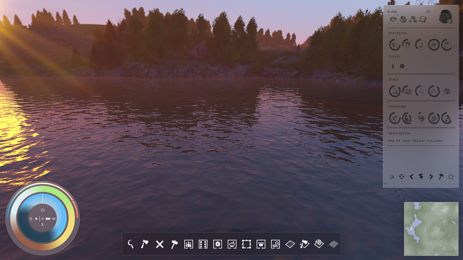
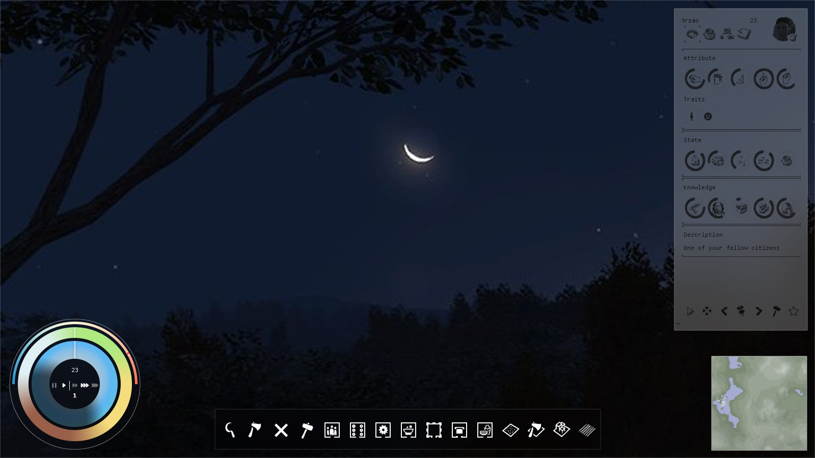
I think the UI looks really good, however I think things like the images on the right need a drop shadow or something to make them feel less 2Dish. It would be amazing if you could animate them, but not necessary.
Is the UI customizable? Like can I move the mini-map to the top right? 
The nice things about this forum are always the ideas and the commitment. My first impression was the same as @ Elfryc: Wow, very elegant and consistent! Then the thought, does it work, under all conditions? Slight doubt. If we can test it in beta for a while, we’ll see. Still find it very elegant and harmonious. 